# View on Tasks
Tulip supports two kinds of views. Further, user can view the timestamp in the tasks in two formats.
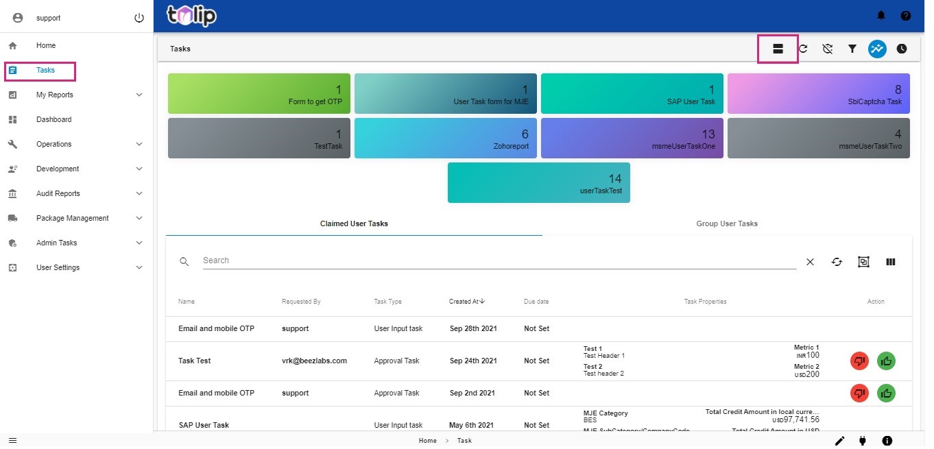
# Table view
The table view is essentially a consolidated view which lets the viewer get an immediate idea on the Task name, Requested By, Task Type, Created and Due dates, Task properties and actions for the list of available tasks. The viewer has an option to choose the columns necessary for his viewing in the table format. He can add or remove the columns being displayed by clicking on the three vertical lined image at the far right corner below the metrics display.
This view is preferred by some users whereas some other users preferred a relatively non-clustered view.
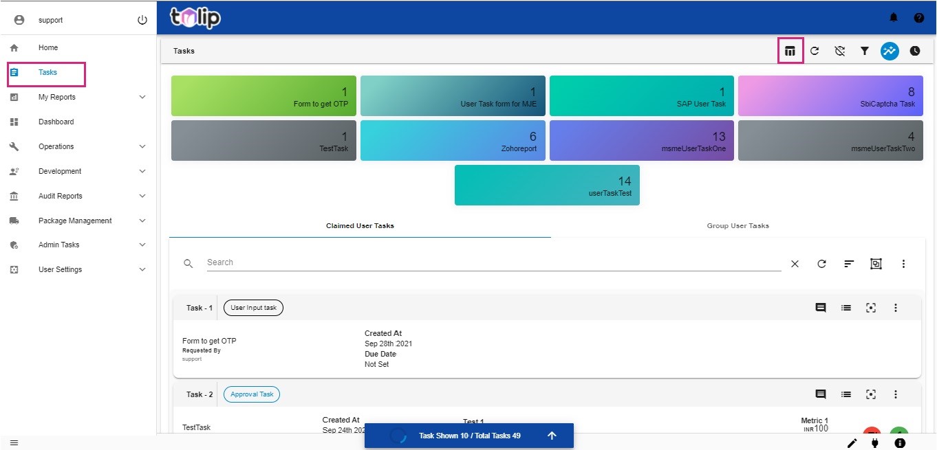
# Card view
Tulip also supports the card view, which shows the Tasks as individual cards, with their respective data in a more focused format. Each card has its own toolbar to perform functions like View/Add comments, Show related tasks, focus the task and other actions. In the card view, the viewer is also provided with an option to sort the cards as per the Task name or the created and due dates.
The default view on opening Tasks is the card view.
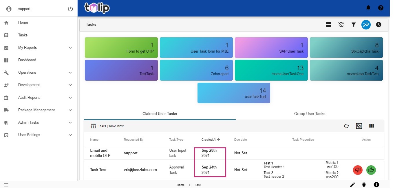
# Timestamp
This release of Tulip provides users with an option to view the Timestamp in different formats. The default view in either table or card view for timestamp is just the date in the format of MONTH DATE YEAR.
Some users are in need of a detailed timestamp with view of the exact time also. So when the user uses the option at the top right corner to toggle time with date, the timestamp appears in the format of MONTH DATE YEAR, HOUR: MINUTES: SECONDS AM/PM.
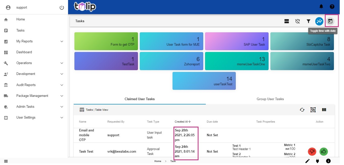
Note: In the UI of Tulip Tasks, any toggle icon always represents the future state. Meaning, the icon would represent the next state/view the user would get, when he tries to click on it. Because of this, the user sees a clock like icon when he is in the first (MONTH DATE YEAR) Timestamp view. Signifying that when he clicks on it, he gets provided with the date with time (MONTH DATE YEAR, HOUR: MINUTES: SECONDS AM/PM) view. Alternatively, the other icon he sees is that like a calendar.
Similarly, in the case of card or table view also, the user gets to see only the future state/ view in the toggle icon.